New hand lettering designs

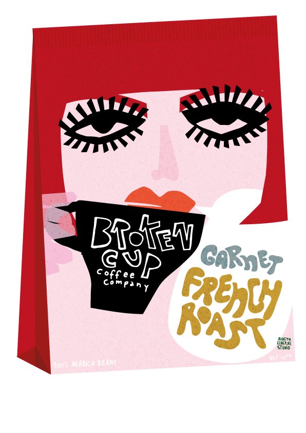
Broken cup coffee company design Sabeth Elberse
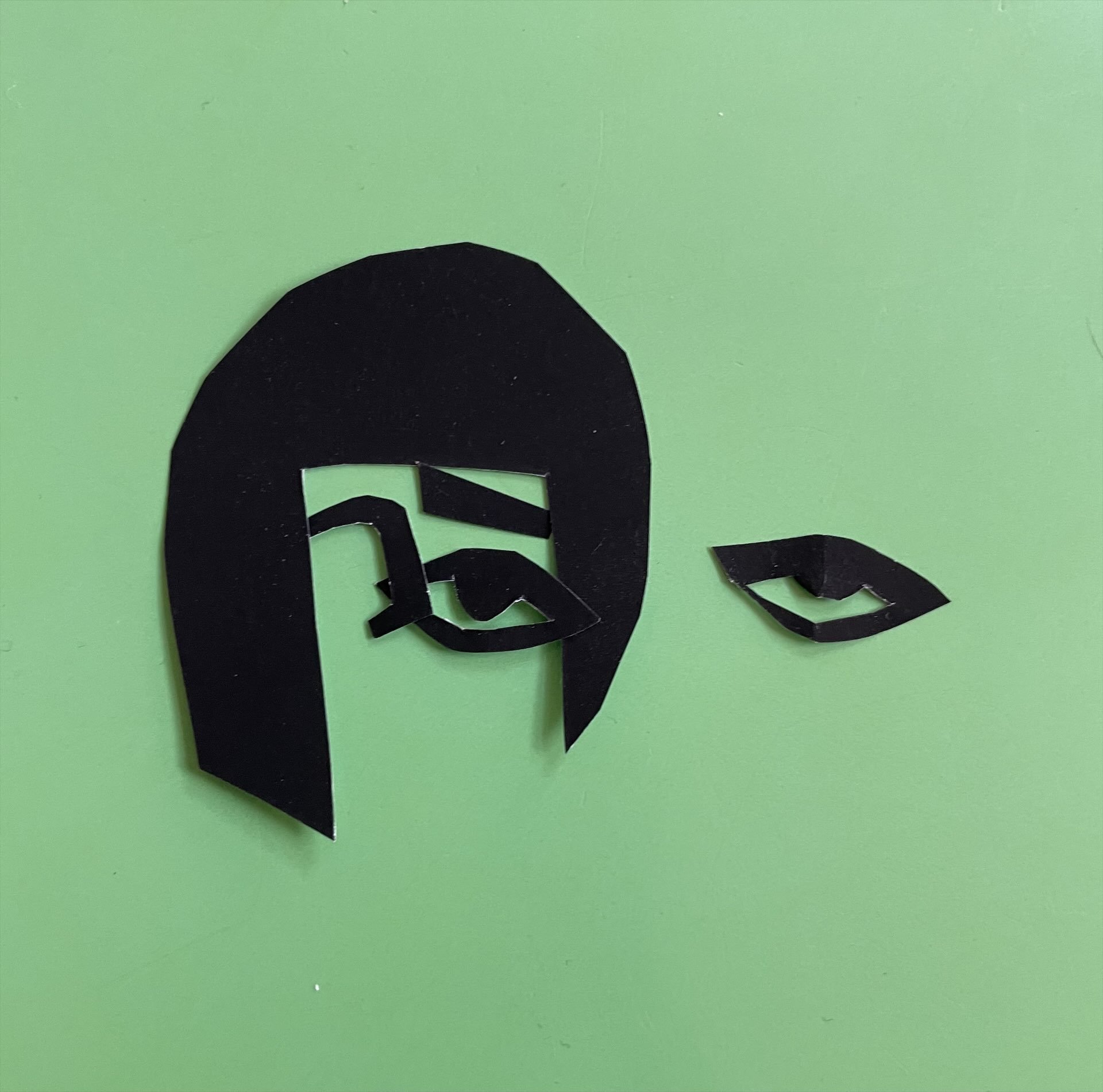
In my blog today I like to tell you about my course and the last 3 designs I created. Once a year I follow the illustrator and studio owner Lilla Rogers e-course. A few years ago she created Make art that sells, in which she invites designers to make work for your portfolio. work that is commercially product based and to discover your own style and handwriting. Thanks to these courses I have really developed my style. I always like the bootcamps the most, you get an assignment per month, in the first week you don't know anything about the final assignment, so you work much more loosely and experiment more. You then work towards a final assignment. this could be a notebook or a pattern or book cover. This year the course was entirely dedicated to hand lettering. Now I always find that difficult, but thanks to these assignments and her way of teaching, I have really started to enjoy it. I'm not into neat letters and certainly not into curly letters. And she isn't either, so the looseness and imperfection suddenly suited me. I combined the handlettering with the way I always work, drawing with scissors.
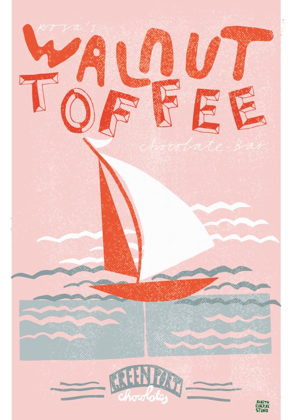
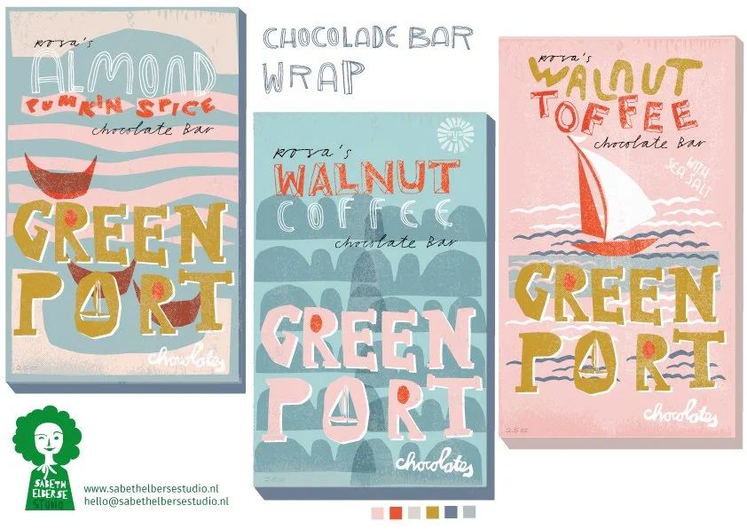
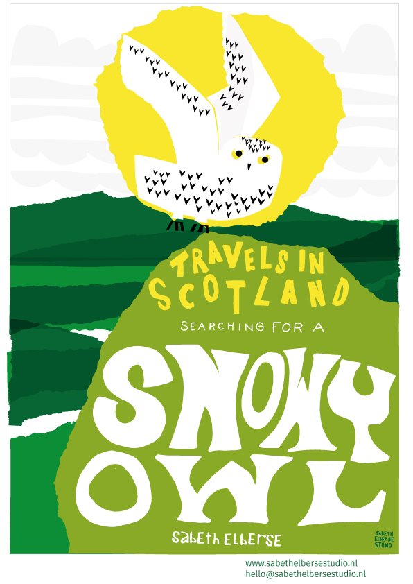
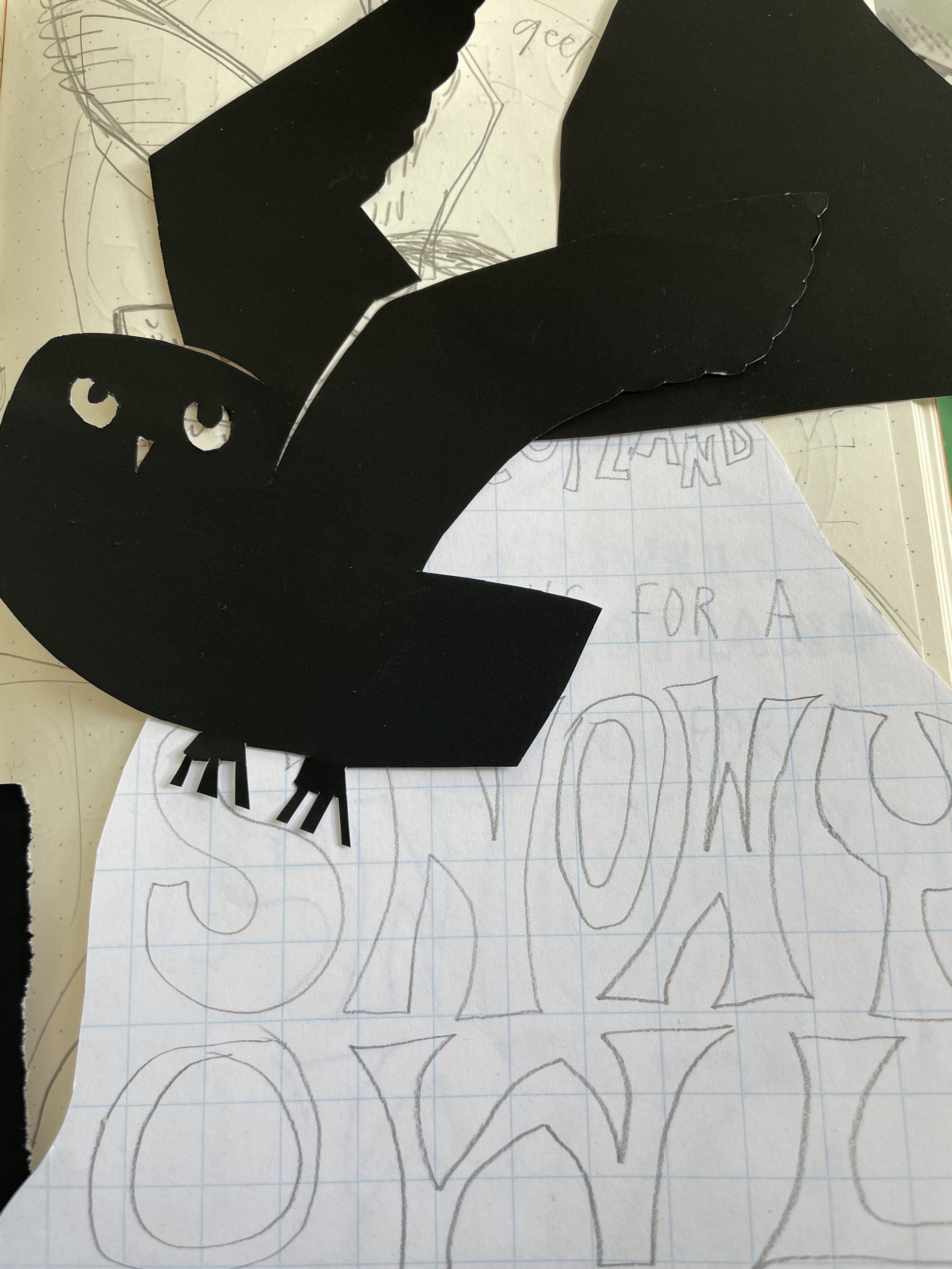
We received 3 assignments, spread over 3 months. Assignment 1 was to design a chocolate bar wrapper for a specific brand of chocolate. This (fictional) chocolate company comes from a seaside resort near New York. And for me, the location triggered the theme of the design, the seaside.. The 2nd assignment: design a bookcover. I received the information for the design: create a cover with a book title Travels in (country or city starting with S) searching for a (animal with an S). Mine became: Travels in Scotland searching for a snowy owl. I wanted to emphasize the roughness of Scottish nature and decided to tear paper. Normally I use scissors, but the torn paper worked so well in the landscape I wanted to design. The 3rd assignment, which I just completed yesterday, was: create a package design for a coffee brand. The brand was Broken cup coffee company and the taste: French roast. Another wonderful assignment to work on! I emphasized the color red for Garnet (mineral stone) French roast and the French style translated into the girl with the French short bob hair. What wonderful assignments these were again. I definitely enjoy designing packaging!

Sabeth Elberse, chocolate wrapper